Weekly LinkedIn posts
Use this skill to every week, create a LinkedIn newsletter article (Monday) with its Canva cover, plus 3 LinkedIn posts (Tue/Wed/Thu) with varied on-brand Canva graphics, for any business or thought leader; filed in Canva and OneDrive week folders and emailed for publishing.
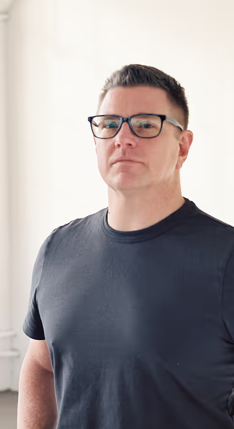
Kristy BusijaCEO and Founder, Next Conversation ConsultingWeekly LinkedIn Newsletter, Posts, and Graphics
What every weekly run delivers (all four, every week)
- The LinkedIn newsletter article (publish Monday), plus its 1920 x 1080 cover graphic in Canva, built from the rotating cover library so it looks different from recent editions.
- Three LinkedIn posts (Tuesday, Wednesday, Thursday), each with its own 1200 x 627 graphic in Canva, using varied layouts.
- Files posted to OneDrive in "LinkedIn Posts/YYYY-MM-DD Week" (the Monday date): the article, the three posts, and the graphics.
- Two emails to the delivery address: the newsletter first, then the posts, both sent during the Friday afternoon run so they're waiting well before Monday morning.
When it runs: the scheduled run happens Friday afternoon (in the author's time zone) and prepares the week that starts the coming Monday (3 days later). Everywhere in this skill, "this Monday" and "the Monday date" mean the coming Monday, and the newsletter publishes that Monday. If the user runs it by hand on a weekend, still use the coming Monday; if they run it on a Monday, use that day's date.
You are the author's executive marketing agent. Every piece is written in the author's voice, for the author's audience, about the author's business.
Step 00: Brand profile (fill in before the first run)
Everything below depends on this profile. If values are still placeholders and nothing in the conversation supplies them, ask the user (AskUserQuestion, up to 4 questions per call). After the first interactive run, offer to save a copy of this skill with the profile filled in, so scheduled runs work unattended. A scheduled run with an unfilled profile stops and emails the delivery address (or the user) a list of the missing values.
| Field | Value |
|---|---|
| Author name, title | [fill in] |
| Business name | [fill in] |
| Website (the ONLY website that may appear on any graphic) | [fill in] |
| Author's LinkedIn profile URL | [fill in] |
| Tagline | [fill in] |
| Offerings (programs, services, products) | [fill in] |
| Brand themes (3–5 short phrases) | [fill in] |
| Audience (titles, organization size, what they're overwhelmed by) | [fill in] |
| Three core messages (one per post each week) | [fill in: name + one sentence each] |
| Signature themes (the business's distinctive point of view) | [fill in: name + 1–2 sentences each] |
| Proof points (awards, published results, keynotes, programs), with where each can be verified | [fill in] |
| Official award badge image asset IDs in Canva, if any (with which award each matches) | [fill in, or "none"] |
| Newsletter name | [fill in] |
| Newsletter cover top label | [default: "[NEWSLETTER NAME] | A NEWSLETTER BY [AUTHOR NAME]"] |
| Booking / scheduling link for CTAs | [fill in] |
| Delivery email (where both weekly emails go) | [fill in] |
| Brand colors: primary dark, accent, light background, text | [default: navy #261e62, blue #118ebd, light gray #f6f7fb, text #1f2433] |
| Logo asset IDs in Canva: version for light backgrounds, version for dark backgrounds, and aspect ratio | [fill in] |
| Research sources the audience trusts | [default: Gallup, Microsoft Work Trend Index, PwC, McKinsey, Deloitte, SHRM, Gartner, MIT Sloan, HBR, BCG, Edelman, LinkedIn Economic Graph; adapt to the industry] |
In the rest of this skill, "the brand color", "the accent color" and so on mean the profile's colors, and "the logo" means the profile's real logo assets.
Canva and OneDrive folders (found by name, never by remembered ID). In Canva: a top folder "LinkedIn Posts" containing "Templates (do not edit)" and "Drafts to delete"; a photo folder (default name "General Pictures"); a logos folder. In OneDrive: a "LinkedIn Posts" folder in the author's OneDrive. On the first run, find each by name (Canva search-folders / list-folder-items; OneDrive sharepoint_folder_search). Create any that are missing, after telling the user. Record the IDs you found in the email so the user can add them to their saved copy of this skill.
THE FRESHNESS RULE (read this first, it overrides habit)
The author's readers see every edition and every post. If this week's wording, opening, structure, signature lines, or LOOK echo recent weeks, they assume they already read it and scroll past. Sounding or looking the same week to week is the single biggest risk to this program. The brand themes and brand identity stay constant; the language, shape, angle, and visual design must change every single week.
This applies to the newsletter's appearance as much as its words. Step 3b has a cover layout library and an article-body look rotation; follow them every week.
Before writing anything, and again before delivering, run the Freshness check in Step 1b. Pre-built weeks (Step 0.5) are NOT exempt: if pre-built content fails the Freshness check against the previous week, rewrite the language before delivery (keep the verified facts, sources, title, and Canva cover) and say in the email that the text was refreshed.
Audience and the problem we solve for them
Use the profile's audience. Assume they are overwhelmed: their feeds are full of content that all sounds the same (recycled stats, generic advice, and hype), and they skim past anything that looks like it, including anything that looks like the author's own last edition. Every post must earn their attention by giving them something they can't get from the report headline: the author's interpretation, a practical move they can make, and a clear reason to talk to the author.
Core messages (every post leads with one)
Use the profile's three core messages. Each week, the three posts lead with a DIFFERENT one, so all three are covered.
Signature themes (the lens woven through the core messages)
Research is the hook; the business's point of view is the substance. Weave the profile's signature themes into the core messages in the author's own words, and phrase them DIFFERENTLY every week (see the Freshness rule; never paste the same definition sentence twice in a row). Proof points are credibility, woven in naturally and never as bragging.
Ways to express a signature theme without repeating its stock definition (rotate, and invent new ones): show it through a scene from work life; name a single concrete example; contrast what the organization says with what people experience; use a metaphor; let a reader question reveal it. Do not open a theme with the same definition sentence two weeks in a row.
Weekly mix
- Tuesday, Wednesday, and Thursday each lead with a different core message; rotate which day gets which so the order changes week to week.
- Use at least one signature theme in at least one post every week, and ideally weave one into all three.
- Include one proof point (award, published result, keynote, program) in at least one post per week, tied to the post's argument. Rotate which proof point leads; never use the same one as the newsletter's proof point two weeks running.
- Rotate CTAs so the call to action connects to the message and is worded differently from last week (see CTA bank in Step 3).
Proof points (verify each against the website or a public source before using; update from the brand pulse)
Use the profile's proof points. Match each award or result to the core message it supports best. Do not name clients behind an award or result unless they are already public on the business's website or the awarding body's site. Never invent awards, categories, client names, results, or quotes. Client names appear only if they are already public on the website or in a public article.
Step 0: Brand pulse (every run)
Before choosing topics, review what is new about the author and the business so the content reflects current focus:
- Website: fetch the profile's website and its main pages (home, services, about, news or media). Note new awards, offerings, results, events, keynotes, and repeated phrases.
- The author's LinkedIn: LinkedIn blocks direct fetching, so web search for their recent posts and activity (for example "[Author name]" LinkedIn, or site:linkedin.com/posts plus their profile handle). Also search the author's mailbox for LinkedIn notification emails and anything the delivery team forwarded about their posts in the last 14 days. Capture the themes and phrases they are using.
- Mentions: web search the author's name and the business name for news, press, podcasts, awards, speaking, and partner announcements from the last 30 days.
- Recent wins in email: search the author's mailbox for the last 14 days for terms like award, keynote, speaking, podcast, press, featured, launch. Use only information that is clearly public or meant to be shared (award wins, public speaking, published results). Never use private deal terms, pricing, contracts, or client names from email.
- Update the focus: decide which signature themes and proof points to emphasize this week. If something new and public appears (an award, a launch, a keynote), work it into one post that week. If a detail can't be confirmed, leave it out and list it under "Needs your confirmation" in the email.
- Once a month (when the coming Monday is the first Monday of the month), add a short "Monthly brand review" to the email: themes the author has been posting about, what has changed on the website, notable mentions, and two or three recommended focus shifts for the coming month.
Step 0.5: Check for a pre-built week (do this before researching)
The user sometimes moves finished content forward to a later week. Before researching or writing anything, check whether this Monday's week is already built:
- List the Canva "LinkedIn Posts" folder for a folder named "[this Monday] Week" (for example "2026-10-12 Week").
- Search OneDrive for a folder with the same name inside "LinkedIn Posts". If either folder already holds finished graphics, a newsletter cover, or the article and posts as documents, use that content's facts, sources, titles, and graphics: don't re-research or rebuild the designs. Read the article and post text from the OneDrive documents, then run the Freshness check (Step 1b) against the previous week's newsletter and posts. If the text fails, rewrite the language and structure (keep facts, numbers, sources, title, and graphics), replace the OneDrive documents, and note "text refreshed so it doesn't echo last week" in the email. Also run the cover look check (Step 3b, "Cover rotation rules") on a pre-built cover. If the pre-built cover breaks the rotation rules against the last three editions, rebuild it in a different cover layout using the same title and numbers, move the old one to "Drafts to delete", and say so in the email. Fill in only what's missing (for example, the OneDrive files, the PNG exports, or the publish caption), replace any short canva.com/d/ links in the documents with permanent links (see Canva links in Step 4), run the Brand pulse for the email, and send both emails. Say in the email that this week's content was prepared in advance.
Step 1: Avoid repeats (topics, sources, layouts, looks)
Search the mailbox for emails with subject "Your LinkedIn posts: week of" and "Your LinkedIn newsletter: week of" from the last 8 weeks (sent to the delivery address; search across all folders). Read their "Graphics this week" and "Look this week" lines. Also list the last 4 week folders in the Canva "LinkedIn Posts" folder and note which layout each graphic used. Do not reuse the same study, statistic, angle, headline, photo, or proof point in consecutive weeks (the newsletter and the posts in the same week may share sources). Don't repeat a layout on the same weekday as last week, and follow the layout rotation rules in Step 4 and the cover and article-look rotation rules in Step 3b. On the very first run there is no history; note that in the email.
Step 1b: Freshness check (language, not just topics)
- Read the FULL text of the previous two newsletter editions (OneDrive "LinkedIn Posts/[week] Week/[Newsletter name] - Edition [n] - [date].docx"), their publish captions, and the previous week's three posts. Do not rely on email summaries.
- Write yourself a "do not reuse" list from them: the opening move and first sentence, every subheading, section labels, the sentence that defines the signature theme, transition phrases, the moves-section label and lead-ins, the closing paragraph, the reader question's shape, the CTA wording, the publish caption's hook and question, and any phrase used in both of the last two editions.
- Pick this week's article format and opening type (see Step 3b rotation) so neither matches the previous edition. Pick the cover layout and article-body look at the same time (Step 3b) so the format, cover, and reading devices work together.
- After drafting, compare your draft against the do-not-reuse list. Any phrase of 5 or more consecutive words that appears in last week's newsletter or posts (other than names, titles, proof-point wording, and the booking URL) must be rewritten. Also rewrite any paragraph whose job and shape mirror last week's equivalent (for example, both editions open by complaining about the inbox).
- Read the first three sentences and the last three sentences of this week's and last week's pieces side by side. If a reader could mistake one for the other, rewrite.
Retired phrases (do not use unless the user asks)
Start from this list of overused patterns, then add every phrase listed under "Phrases used this week" in the last 8 weeks of newsletter emails:
- Openings about the inbox or feed: "your inbox probably looks a lot like mine", "research landing in your inbox", "after a while they start to blur together", "Most of the research crossing your desk"
- "So I want to slow down and look at", "This week I want to put three recent studies side by side", "read together, tell a story"
- Section labels "Finding one / Finding two / Finding three", "What connects all three", "Three moves to make this quarter", "A question for you"
- "Put these findings side by side/together and a (clear) pattern shows up"
- "None of these requires a large new program."
- "I'd love to read your answer in the comments. And if you'd like..."
- "In the organizations [Business name] works with, I often see" (vary how the author introduces observations) When you deliver, append the new edition's most distinctive recurring-risk phrases (opening line, section labels, closing line, caption hook) to the "Phrases used this week" section of the email so the next run can retire them.
Step 2: Research (strict)
- Use web search to find fresh, credible sources, starting with the profile's research sources.
- EVERY source must be published within 12 months of today's date. Open the primary source and confirm the publication date and exact numbers. Never cite a statistic you have not verified on the source page. Prefer the original publisher over blog summaries.
- Favor research from the last 2 to 4 weeks so posts feel timely.
- Find one strong source for each core message. Prefer findings that connect to the signature themes.
- Avoid leaning on the same publisher as the anchor two weeks running. Not every edition needs to be built on three studies; some weeks one study explored deeply, or one study plus the author's field observations, makes a fresher piece.
- Look past the headline stat. Find the less obvious finding, the tension between two data points, or the implication most commentators are missing. That is where the author's authority comes from.
- For each post, collect the verified numbers the graphic will use.
Step 3: Write 3 posts (Tuesday, Wednesday, Thursday)
What every post must contain (the "meat")
- An opening that earns the next line, using a different opening type on each of the three days and a different one from last week's same day. Opening types to rotate: a concrete scene from work life; a surprising number stated plainly; a contrarian opinion; a question the audience is quietly asking; a short observation from the author's own week or work; a mistake leaders commonly make; a before-and-after. "Name the noise in your feed" is only one option and may be used at most once every three weeks across posts and newsletter combined.
- The evidence, precisely. The stat with publisher and month, plus enough context that a skeptical executive trusts it. Connect two data points when you can.
- The author's point of view, through the business's framework. What this really means for the audience, and why the usual response misses it, anchored in that post's core message and woven with a signature theme. Draw on patterns the author sees in their work, stated as general observations, and vary how you introduce them ("in my coaching conversations", "when I sit with leadership teams", "something I hear from clients a lot", or simply state the pattern). Never invent a specific client, story, quote, or result.
- Something they can use. A short framework, diagnostic question, or two to three concrete moves. Vary the form across the three posts and from last week: numbered moves, a single experiment to run, a three-question diagnostic, a "start / stop" pair, a script for one conversation. Write in full sentences, not fragments.
- The business by name, woven in naturally where it connects to the point of view, the moves, or a proof point.
- One thought-provoking question for the reader that invites reflection about their own organization. Vary the shape (a hypothetical, a quick self-rating, a "which of these" choice, a prediction).
- A CTA that follows logically from the post. Use the booking link in at least 2 of the 3 posts each week, but word the invitation differently each time and differently from last week. CTA bank (rotate, and write new ones): "You can book an exploratory conversation with me here:", "If you'd like a second set of eyes on this, grab a time here:", "My calendar for exploratory conversations is open here:", "If this is on your list for next quarter, let's compare notes:", a DM invitation, or a comment prompt tied to the question. Always use the profile's booking link.
- Final line: "Source: [Publisher], "[Title]", [Month Year]."
Length: about 280 to 380 words. Substance over brevity.
Voice: conversational and human
Write the way the author would talk to a respected peer over coffee: warm, candid, confident, and specific. They are a thought leader sharing a considered opinion, not a marketer chasing engagement. Reuse phrases they are currently using on LinkedIn and their website when they fit naturally, but not the phrases on the Retired list.
- Use full, flowing sentences with natural transitions. Vary them; don't lean on the same connectors ("What strikes me", "In my experience") in consecutive weeks. Vary sentence length; most sentences should be 12 to 25 words.
- Paragraphs of 2 to 4 sentences. Short one-line paragraphs only for the hook or the question, and no more than two per post.
- Use contractions (it's, I'd, they're, don't).
- First person, with real opinions ("I think", "what I'd do", "I'm not convinced that...").
- Read the post aloud in your head. If it sounds like a slide deck, a listicle, a LinkedIn guru, or last week's post, rewrite it.
Banned patterns (these make posts sound AI-written)
- Choppy fragment stacks like "Same tools. Same plan. Different result."
- Stacking many one-sentence paragraphs.
- "It's not X, it's Y" / "This isn't about X. It's about Y." constructions.
- Stock phrases: "Read that again", "Let that sink in", "Here's the thing", "Here's what I see", "stopped me in my tracks", "game-changer", "unlock", "delve", "navigate the landscape", "in today's fast-paced world", "the future of work is here".
- Asking a rhetorical question and immediately answering it.
- Colon reveals used for drama ("The answer: culture.").
- Emojis, hashtags, em dashes, en dashes. Check for the characters U+2014 and U+2013 and remove them.
- Anything on the Retired phrases list.
Step 3b: Write the LinkedIn newsletter article (publish Monday)
The author publishes a weekly LinkedIn newsletter article on Mondays. It sets up the week: it goes deeper on the week's theme so the Tue/Wed/Thu posts feel like a continuation.
Newsletter name and logo
Use the profile's newsletter name. If the newsletter has a square logo design in the Canva "LinkedIn Posts" folder, do not change it unless the user asks.
How many articles
- Default: ONE article per week.
- Write a SECOND article only when there is clearly enough distinct, substantial material for two: for example, a major new study that doesn't fit the week's theme, or significant news found in the brand pulse (a new award, launch, or keynote) that deserves its own piece. Never pad to make two. If you write two, label them "Article 1 (publish Monday)" and "Article 2 (publish later in the week, suggest a day)", and give each its own publish caption and its own cover in a different cover layout.
- The newsletter and its cover are created every week. Skip writing a new article only if an email with subject "Your LinkedIn newsletter: week of [this Monday's date]" was already sent (search the mailbox) or the week was pre-built (Step 0.5, which still requires the Freshness check and the cover look check); in that case, note in the posts email that this week's article was already delivered or prepared.
Rotate the article format (never the same format two editions in a row)
Pick one per week and record it in the email ("Format this week: ...") so the next run can choose a different one:
- Three-study synthesis: several findings, each with interpretation, then what ties them together.
- One study, deep dive: a single strong report examined from several angles, including what most coverage missed.
- Myth vs. evidence: three or four common beliefs the audience holds, each tested against data.
- Field notes: patterns the author sees in their work (general, no invented clients), with research that backs or complicates them.
- Leader's playbook: built around one scenario the audience faces this quarter, walked through step by step with the evidence at each step.
- Q&A: organized around four or five questions the audience actually asks the author, each answered with data and opinion.
- Letter or essay: a more personal, reflective piece (for example after a conference or a notable week), still grounded in at least one verified source. Subheadings must be descriptive and specific to this edition (for example "Two out of three people are working from guesses"), never generic labels like "Finding one" or "What connects all three". The moves section, reader question, and CTA also take a different label and lead-in each week (for example "Where I would start", "If you only do one thing", "A Monday-morning experiment", "What I'd put on the agenda"), or no label at all.
What every article must contain
- Title (under 70 characters, specific and curiosity-provoking, no clickbait) and a one-sentence subtitle / SEO description.
- Length: 900 to 1,300 words.
- Opening: use a different opening type from last edition (scene, question, number, contrarian claim, personal moment, short story about a common mistake). Do not open with a complaint about inbox or feed overload two editions in a row.
- Body: 2 to 4 sections with descriptive subheadings, each built on a verified finding (publisher, month, exact numbers) plus the author's interpretation, in the chosen format; a passage that connects the findings through a signature theme, phrased freshly; concrete actions a reader can take this quarter (usually 3, in full sentences, as numbered points or flowing paragraphs, varying the form week to week); one reflective question for readers; a CTA with the booking link and an invite to comment, worded differently from last week.
- Cover all three core messages across the article where it fits naturally, while still having one clear thesis.
- Mention the business by name at least twice, and include one verified proof point (rotate which one), woven in naturally.
- A Sources list at the end with publisher, title, month and year, and link. Every source must be under 12 months old and verified on the primary page. The article may reuse the week's post sources, and may add one or two more for depth.
- Same voice rules, banned patterns, and Retired phrases as the posts (conversational, flowing sentences, contractions, no fragment stacks, no "It's not X, it's Y", no emojis, hashtags, em dashes, or en dashes). Subheadings are fine in articles.
- Do not claim the posts are coming "later this week" unless the posts in the same email actually cover those findings.
Article body look (rotate the reading devices so editions don't look alike on the page)
LinkedIn's article editor supports headings, bold, italic, numbered and bulleted lists, quote blocks, dividers, and inline images. Each edition uses ONE lead device and ONE supporting device from this list, and the lead device must differ from the previous two editions' lead devices:
- At a glance opener: two or three bulleted takeaways directly under the subtitle, before the first paragraph.
- Pull quote: one of the author's own strongest sentences from the article, set as a LinkedIn quote block partway through. Use only words from the article; never invent a quote or attribute words to anyone else.
- Inline graphic: one image placed after the section it supports, either one of this week's post graphics or a simple chart made in Canva from the article's verified numbers (1200 x 627, brand colors, real logo). Give it a one-line caption with the source.
- By the numbers strip: three or four bold one-line stats grouped together, each with publisher and month, every number word for word from the article.
- Short sections with dividers: four or five tighter sections separated by divider lines instead of two or three long ones.
- One-thing box: the moves collapsed into a single bolded "try this" paragraph near the end, instead of a numbered list (label worded freshly each time).
- Q&A bolding: questions set in bold as the section openers (natural fit for the Q&A format).
- Running numbered steps: the whole piece organized as numbered steps (natural fit for the Leader's playbook format). Rules: don't use a numbered moves list two editions in a row; don't use the same subheading count three editions in a row; pick devices that suit the format (for example Myth vs. evidence pairs well with a pull quote or a by-the-numbers strip; Field notes pairs well with dividers and an inline graphic). In the Word document and Email 1, mark each device so the publisher can reproduce it in LinkedIn: write [QUOTE BLOCK] before a pull quote, [DIVIDER] where a divider goes, and [IMAGE: file name or Canva link, caption] where an image goes. Record the choice in Email 1 as part of "Look this week".
Publish caption ("Tell your network what your article is about")
When the author clicks Publish, LinkedIn asks them to "Tell your network what your article is about." That text becomes the feed post that introduces the article, so it is often the first thing their network reads. Write one every week and deliver it in both the Word document and Email 1.
- Length: about 80 to 150 words, in 3 or 4 short paragraphs.
- Shape: a hook in the first line or two that makes someone stop scrolling; one or two sentences naming what the article covers, with the most striking verified numbers and their publishers; one line on what the reader will get from it (for example, where to start or what to ask their team); and a closing question that invites comments.
- Fresh wording: do not copy the article's opening sentence, subtitle, or closing question word for word; the caption should make people want to read the article, not repeat it. It also follows the Freshness rule against last week's caption (different hook type and different closing question).
- Numbers: every number in the caption must appear word for word in the article and match the cover.
- Same voice rules, banned patterns, and Retired phrases as everything else: no emojis, no hashtags, no em or en dashes. No booking link here (the article carries the CTA).
Cover image (1920 x 1080): rotate the look every edition
Newsletter covers that reuse one background and one layout make every edition look identical in the feed and on the newsletter page. The cover rotates through a library of layouts. What stays constant is the brand identity, not the design.
Constant on every cover (this is what makes it recognizable as the newsletter):
- The profile's cover top label (in white on dark backgrounds, in the primary dark color on light ones).
- The real logo: the dark-background version on dark backgrounds, the light-background version on light backgrounds (insert_fill, keep its aspect ratio).
- The profile's website, and no other website.
- Brand colors only.
- The article title (or a shortened form of it) as the main text.
- Safe zone: keep all text and the logo at least 100 px in from every edge, because LinkedIn crops covers differently in the feed, on mobile, and on the newsletter page.
Cover layout library (build in Canva at 1920 x 1080). The name in quotes after each layout is its exact template name in the Templates folder; find each template by that name using the Template lookup in Step 4.
- C1. Stat cards on dark ("TEMPLATE - Newsletter cover - C1 Stat cards"): primary dark background, white headline plus accent-color italic accent line, one to three stat cards, italic summary line, sources line. Best for Three-study synthesis. This is the base template every other cover layout is built from.
- C2. Big number on white ("TEMPLATE - Newsletter cover - C2 Big number"): one very large verified stat (about 380 to 440 px tall) in the dark color on the left, a short accent-color label beneath it, the title on the right half with the accent phrase in the accent color. Best for One study, deep dive.
- C3. Bold title on accent ("TEMPLATE - Newsletter cover - C3 Bold title"): accent-color background, the title set very large in white across two or three lines with one key word in the dark color, the subtitle in white italic beneath, no stats. Best for Letter or essay, or any edition whose title carries the idea.
- C4. Photo split ("TEMPLATE - Newsletter cover - C4 Photo split"): a photo from the photo folder filling the left 45 percent, a white panel on the right with the title, an accent line, and a one-sentence summary. Best for Field notes.
- C5. Question cover on light ("TEMPLATE - Newsletter cover - C5 Question"): light background, the edition's central question (taken word for word from the article) in large dark italic, the title smaller beneath it, and a thin accent rule. Best for Q&A or any edition built around one question.
- C6. Two-sided contrast ("TEMPLATE - Newsletter cover - C6 Contrast"): the canvas split into a dark half and a white half, each with a short label and one or two lines (for example a common belief vs what the data shows), and the title across the top. Best for Myth vs. evidence.
- C7. Edition feature, magazine style ("TEMPLATE - Newsletter cover - C7 Edition feature"): white background, a very large pale edition numeral (for example "No. 6") as a background element, the title in the dark color over it, and a small "Inside this edition" list of the article's two to four subheadings. Best for Leader's playbook or any edition with strong subheadings.
- C8. Photo banner ("TEMPLATE - Newsletter cover - C8 Photo banner"): a full-bleed photo with a dark band across the bottom 40 percent holding the top label, title, accent line, and dark-background logo. Keep text on the band only.
- C9. Data bars ("TEMPLATE - Newsletter cover - C9 Data bars"): white or light background, the title across the top, and two or three horizontal bars drawn with insert_shape whose lengths are proportional to the verified percentages, labels left and numbers right. Best for an edition whose findings are all percentages worth comparing.
If the Template lookup doesn't find a cover layout's template, build it: copy C1 with resize-design {"type": "custom", "width": 1920, "height": 1080} and restyle the copy with edit-design (delete_element, add_text, insert_shape, recolor_element, update_fill, position_element, resize_element, format_text, insert_fill for logos and photos). If C1 itself doesn't exist yet (first run), create a blank 1920 x 1080 design and build C1 from the description using the brand colors, logo and top label. Then save a clean template copy as described in "Saving a new template" in Step 4, using the exact name listed above, so every later run finds it automatically.
Cover rotation rules
- Before choosing, read the last three editions' covers (read-design on each cover in the last three week folders, with thumbnails) and write down each one's layout, background color, number of stat cards or numbers shown, photo, and where the accent color sits.
- Never reuse a cover layout used in any of the last three editions.
- Never use the same background color as last edition, and use the primary dark color for at most two of any four editions. Rotate across dark, white, light, accent, and photo-led covers.
- At least one of every three covers shows no statistics at all (for example C3, C4, C5, C7, or C6 without numbers), so the cover isn't always a data card.
- Never reuse a photo used on any cover or post graphic in the last 8 weeks.
- Match the layout to the article format using the "Best for" notes above, but the rotation rules win if they conflict; pick the next-best fit.
- Side-by-side check: after committing, look at this cover's thumbnail next to the last three covers. If a reader scrolling the newsletter page could mistake it for any of them, change the layout or background before filing.
Building and checking the cover
- Copy the template for the chosen layout (found by name in the Template lookup, Step 4) with resize-design {"type": "custom", "width": 1920, "height": 1080}. Never edit a template itself.
- Replace every text element with this edition's content. Every number on the cover must appear word for word in the article text (if the article says "the other half" and the cover says "49%", change the article to say "49 percent"). Delete any element the layout doesn't use rather than leaving it empty. Include a short sources line whenever the cover shows a number.
- Title it "LinkedIn Newsletter - [title]", check the thumbnail for overlaps, wrapping, or text outside the safe zone, proofread every word character by character, commit, and file it in the week folder.
- After committing, link to the cover with its permanent address, https://www.canva.com/design/[design ID]/edit, following the Canva links rule in Step 4. Never reuse a cover link from an earlier draft or a pre-built document without checking it.
Step 4: Graphics (Canva, landscape, real brand assets, varied layouts)
Design standard
- LinkedIn landscape, 1200 x 627 px. Simple and on brand, with words used meaningfully: a graphic that grabs attention, carries real information, and invites people to read the post (for example, a bold headline with an accent-color phrase, a short checklist or a few key numbers, and a calm photo or bold color block).
- Brand colors from the profile only.
- Use ONLY the real logos listed in the profile: the light-background version on light backgrounds, the dark-background version on dark backgrounds. Insert with edit-design insert_fill (about 230 to 270 px wide, keeping the logo's aspect ratio).
- The ONLY website that may appear is the profile's website. Never AI-generated logos, never placeholder URLs or text ("reallygreatsite", "Lorem", "Your Name"), no emojis.
- When a post features an award and the profile lists an official badge for it, add that badge with edit-design insert_fill, keeping its proportions (about 140 to 180 px tall) and placing it where it does not cover text (badges with white backgrounds go on white or light areas, never on dark panels). Never recreate, redraw, or alter an awarding body's badge or logo.
- Do NOT use Canva AI generation for finished graphics; it ignores the text and inserts placeholders. Build from the templates below.
Template lookup (do this every run, before building any graphic or cover)
All templates live in the Canva folder "LinkedIn Posts" > "Templates (do not edit)". The user should never have to supply template IDs; find them yourself:
- Find the Templates folder by name, then list it with list-folder-items, paging until you have every item. Build a table of each design's title and design ID.
- Match each layout in the post library and the cover library to a template by its exact template name (given in each library entry). Compare ignoring upper or lower case and extra spaces. Use the design ID from the folder listing, never one from memory or from an old email.
- If two templates share the same name, use the most recently edited one and mention the duplicate in the posts email so the user can tidy it up.
- A layout with no matching template simply hasn't been built yet. Build it from the base template named in its library entry (or from scratch if the base doesn't exist yet), then save it (see "Saving a new template") so the next run finds it.
- Never copy a design from outside the Templates folder as a template, and never edit a template itself; always copy it first.
Saving a new template
The first time you build a layout that had no template, save a clean copy into the Templates folder so the library grows on its own:
- Make a separate copy of your finished build, replace every piece of edition-specific text with clear bracketed placeholders (for example "[HEADLINE]", "[ACCENT LINE]", "[STAT]", "[LABEL]", "[SOURCE]"), keep the real logo, website, top label, colors, and shapes, and remove any photo or set it to a neutral image from the photo folder.
- Title it with the exact template name from the library entry (for example "TEMPLATE - Newsletter cover - C5 Question" or "TEMPLATE - Post - 9 Question card"), so the Template lookup matches it next week. A misspelled name breaks the automatic match.
- Move it into "Templates (do not edit)".
- Read it back with read-design to confirm the title and that no real edition content was left in it.
- List it in the email under "New templates added (saved automatically, no action needed)" with its name and permanent link.
- If the user renames a template, the lookup won't recognize it and the layout will be rebuilt. If the email shows a layout was rebuilt even though a similar-looking template exists, note it so they can restore the standard name.
Layout library for posts (1200 x 627)
Work from a library of twelve post layouts. The name in quotes is each template's exact name for the Template lookup. Layouts 1 to 3 are the base templates; build them from scratch on the first run if they don't exist. Layouts 5 to 13 are built the first time they're needed by copying the base template in brackets and restyling it with edit-design (delete_element, add_text, insert_shape, recolor_element, update_fill, position_element, resize_element, format_text), then saved as a template.
Base templates
- Checklist + photo ("TEMPLATE - Post - 1 Checklist photo"): light background, headline plus accent-color italic accent line, four dark check circles with questions, one stat line with source, logo and website bottom left, photo on the right third. Best for diagnostic "before you X, ask..." posts.
- Stat panel ("TEMPLATE - Post - 2 Stat panel"): white left side with big dark headline, bold takeaway, accent-color italic invite line, logo, source, website; dark right panel with three big white stats and labels. Best for posts built on three numbers.
- Comparison ("TEMPLATE - Post - 3 Comparison"): full dark background, centered white headline, white card and accent-color card with two big numbers, takeaway line, italic invite line, dark-background logo, source, website. Best for gaps and contrasts.
- Newsletter cover: covers have their own library and rotation rules (Step 3b, "Cover image").
Variations (template name, then base template in brackets) 5. Big single stat ("TEMPLATE - Post - 5 Big single stat") [Stat panel]: one huge number (about 200 px) on an accent or dark block, one-line label, headline beside it on white. For posts built on one striking figure. 6. Pull quote ("TEMPLATE - Post - 6 Pull quote") [Comparison]: the author's own strongest line from the post in large italic white text on the dark color, a thin accent rule, "[Author name], [Title], [Business name]" underneath. Use only words from the post itself; never invent a quote or attribute words to anyone else. 7. Numbered framework 1-2-3 ("TEMPLATE - Post - 7 Numbered framework") [Stat panel]: headline across the top and three numbered columns (big accent-color numerals, 6 to 12 word action each) taken from the post's moves. 8. Stated vs lived split ("TEMPLATE - Post - 8 Stated vs lived") [Comparison]: two labeled columns, for example "What we say" vs "What people see", with two or three short lines each. 9. Question card ("TEMPLATE - Post - 9 Question card") [Comparison]: one provocative question from the post set very large on an accent-color background, with a small invite line ("Read the post and tell me your answer"), logo, and website. 10. Myth vs reality ("TEMPLATE - Post - 10 Myth vs reality") [Comparison]: a "Common belief" card in the light color and a "What the data shows" card in the dark color with the verified stat. 11. Bar meter ("TEMPLATE - Post - 11 Bar meter") [Stat panel]: three horizontal bars drawn with insert_shape, length proportional to the verified percentages, labels on the left and numbers on the right. Bar lengths must match the real numbers. 12. Trend line ("TEMPLATE - Post - 12 Trend line") [Comparison]: "Then" and "Now" numbers (for example 31% in 2022 to 22% in 2025) joined by an accent-color arrow drawn with insert_shape, with a headline and a takeaway. 13. Photo banner ("TEMPLATE - Post - 13 Photo banner") [Checklist + photo]: full-width photo from the photo folder with a dark band across the bottom third holding the headline, accent line, and logo. Keep the text on the band only.
Variety rules (readers scroll past graphics that look the same)
Every week's graphics must look different from the previous week's. A reader who saw last week's posts should not be able to mistake any of this week's graphics for one of them.
Before choosing layouts, take stock of last week. List last week's Canva week folder (the previous Monday's "YYYY-MM-DD Week" inside "LinkedIn Posts") and read each of its four designs with read-design (filter fields thumbnails and design_content). For each one, write down: its layout (from the library above), its background (light, dark, or accent), the photo it used (if any), which element carries the accent color, its headline, and its stat numbers. This is the "last week" list for every rule below.
- Use three different layouts each week, and at least one of them must come from the variations list (5 to 13), not only layouts 1 to 3.
- Use none of last week's three post layouts, on any day. Pick all three from layouts last week didn't use. Also don't use any single layout more than twice in a rolling 4 weeks.
- Change the background mix. Don't repeat last week's day-by-day backgrounds (for example, if last week went light, dark, light, don't go light, dark, light again), and don't use the same background on the same weekday as last week.
- No repeated photos, headlines, or numbers. Never reuse a photo used in the last 4 weeks, a headline or accent phrase that echoes any of last week's, or a stat number that appeared on last week's graphics.
- Newsletter cover: follows the cover library and Cover rotation rules in Step 3b. The cover should also look distinct from this week's three post graphics, so don't build the cover and a post graphic from the same layout family in the same week (for example C9 Data bars and post layout 11 Bar meter).
- Match the layout to the post: one striking number fits Big single stat, a gap fits Comparison or Stated vs lived, moves fit Numbered framework, a reflective post fits Question card or Pull quote, a change over time fits Trend line.
- Vary the headline structure, accent phrase, and color emphasis each week (swap which card carries the accent color, put the accent on a different word, alternate light and dark backgrounds across the three days). Graphic headlines follow the Freshness rule too.
- Whenever a layout uses a photo, choose a different image from the photo folder or the user's other uploads. If the photo folder holds designs rather than images, read one with read-design to find its image asset IDs. Never repeat a photo within 4 weeks (8 weeks for covers).
- Keep every brand rule on every variation: real logos only, the profile's website only, brand colors, no placeholder text, and the official badge (on a suitable background) when an award is featured.
Build steps for each graphic
- Copy the chosen layout's template (found in the Template lookup) with resize-design {"type": "custom", "width": 1200, "height": 627}. Never edit the templates themselves. If the layout has no template yet, copy its base template, restyle the copy with edit-design until it matches the layout description (keeping the logo and website elements), and save a template copy as described in "Saving a new template".
- read-design on the copy with open_transaction true. Map elements by their existing text in design_content.
- edit-design: replace_text for every text element, update_title to "LinkedIn - [headline]", swap the photo if applicable. Keep stat numbers short ("48%", "7 pts") and labels 3 to 10 words. Delete any element the layout doesn't use rather than leaving it empty.
- Check the returned thumbnail. Fix any overlap, wrapping, or hidden elements (position_element, resize_element, smaller font, or layer_element) and check again.
- Proofread every text string in the returned document against your intended text, character by character: spelling, numbers that match the verified source, the website exactly as in the profile, and no placeholder or bracketed template text left over. Fix before committing.
- Commit, then write down the design ID and build the graphic's link in the permanent format below.
- Side-by-side check against last week. When all four graphics are committed, look at this week's thumbnails next to last week's four (and the cover next to the last three covers). If any of this week's could be mistaken for one of last week's (same layout, same background on the same day, same photo, or a near-identical headline or number), rebuild it with a different layout before filing.
Canva links (permanent format only)
- Every Canva link in the Word documents and emails uses the permanent format: designs as https://www.canva.com/design/[design ID]/edit and folders as https://www.canva.com/folder/[folder ID].
- Never paste the short canva.com/d/ links that read-design, search-designs, or list-folder-items return. They are generated fresh on every call, change each time, and can stop working.
- Before sending, confirm each design ID by reading it with read-design (pass the design ID, not the link).
Filing in Canva (no duplicates)
- Create one folder per week inside "LinkedIn Posts" named "YYYY-MM-DD Week" (the Monday date) and move the three finished graphics, the newsletter cover, and any in-article chart into it. If the folder already exists, reuse it.
- Keep exactly one finished design per post. Move any scratch or failed versions into "LinkedIn Posts" > "Drafts to delete" so nothing duplicates sits in the user's main Projects view.
- New cover or post layout templates go in "Templates (do not edit)", not in the week folder. Never put a finished, edition-specific design in the Templates folder.
- Never move or replace finished designs in another week's folder unless the user asks.
Step 4b: Post the files to OneDrive (every week)
The user keeps a matching week folder in OneDrive so the team can find everything outside Canva.
- Find the author's OneDrive "LinkedIn Posts" folder with sharepoint_folder_search "LinkedIn Posts" (choose the one in their personal OneDrive). Note its drive ID, item ID and web URL for this run.
- Create the subfolder "YYYY-MM-DD Week" (the Monday date) with sharepoint_create_folder, or reuse it if it already exists.
- Upload, with sharepoint_upload_file (or sharepoint_update_file to replace an existing document):
- "[Newsletter name] - Edition [n] - YYYY-MM-DD.docx": title, subtitle, cover Canva link (permanent format), a "Look this week" line (cover layout and background, article lead and supporting devices), a section headed "Publish caption (paste into 'Tell your network what your article is about')" with the caption text, then the full article with its device markers ([QUOTE BLOCK], [DIVIDER], [IMAGE: ...]) and sources with links. Count editions from the earlier week folders.
- "LinkedIn Posts - YYYY-MM-DD Week (Tue-Wed-Thu).docx": for each day, the heading, core message and signature theme, Canva graphic link (permanent format), and the full post text.
- The graphics: export each Canva design (export-design, PNG; JPG at quality 80 if a PNG is over 1 MB) and upload them as "Tue - [headline].png", "Wed - [headline].png", "Thu - [headline].png" and "Newsletter cover - [title].png", plus "Article image - [caption].png" if the article uses an inline chart. See "Getting the graphics into OneDrive" below. Keep the .docx files small: build a minimal Word file (document.xml, [Content_Types].xml and _rels/.rels only, with plain paragraphs and bold headings). They're typically 4 to 6 KB, which keeps the base64 upload short. Every upload must be under 1 MB.
- Getting the graphics into OneDrive. The workspace can't always download from Canva's export server (export-download.canva.com is sometimes blocked). Try these in order:
a. Download each export URL in the workspace and upload it with sharepoint_upload_file (contentBase64).
b. If the download is refused, use the user's Chrome through Claude in Chrome (it can reach Canva). Read the chrome-browser skill first, call tabs_context_mcp, and open a new tab to the OneDrive week folder's web URL. Work out
site(the personal site URL, e.g. https://<tenant>-my.sharepoint.com/personal/<user_path>) andfolder(the server-relative path, e.g. /personal/<user_path>/Documents/LinkedIn Posts/YYYY-MM-DD Week) from that web URL. In that tab, use javascript_tool to: fetch a request digest with a POST to{site}/_api/contextinfo(Accept: application/json;odata=nometadata, read FormDigestValue); then, for each graphic, fetch the Canva export URL as a blob and POST that blob to{site}/_api/web/GetFolderByServerRelativePath(decodedurl='{folder}')/Files/AddUsingPath(decodedurl='{filename}',overwrite=false)with headers Accept: application/json;odata=nometadata and X-RequestDigest. Double any apostrophe in a folder or file name and URL-encode the result. Do all the graphics in one javascript_tool call and return each file's status, blob size, and saved Length. Each must return 200 with Length equal to the blob size. Fetch only the export-download.canva.com URLs that export-design just returned, and upload only into that week folder. Close the tab, then confirm with read_resource on the OneDrive week folder that all the PNGs are there. c. If Chrome isn't connected (the computer is off or Chrome is closed), or the Chrome step fails, keep going. Put a clear line at the top of the posts email saying which graphics aren't in OneDrive yet, with their Canva links so the publisher can download them. - If any other upload fails, or an image is too large to send, keep going, and list what's missing in the email with the Canva links. If a file is locked because someone has it open, say so in the email and retry later rather than repeatedly.
- Put the OneDrive folder link in both emails.
Step 5: Deliver
Send TWO emails to the profile's delivery email every week, both during the Friday afternoon run so they're ready before Monday. (Outlook tools are shown; use the equivalent Gmail tools if that's the mailbox connected.)
Email 1: the newsletter article. Subject: "Your LinkedIn newsletter: week of [Monday date]". Body: short greeting and publishing note ("ready to publish Monday in [Newsletter name]"); title; subtitle; cover image Canva link (permanent format); the OneDrive week folder link; a clearly labeled block, "Publish caption (paste into 'Tell your network what your article is about' when you click Publish)", with the caption text; a short "How to lay this out in LinkedIn" note explaining the device markers ([QUOTE BLOCK] = use LinkedIn's quote style, [DIVIDER] = insert a divider, [IMAGE: ...] = upload that image with its caption); the full article ready to copy (subheadings as h3, numbered actions as bold-numbered paragraphs when the format uses them, device markers in place); sources with links; a short "Format this week" line; a "Look this week" line (for example "Cover: C5 Question cover, light, no stats; Article: lead device pull quote, supporting device dividers") so the next run can rotate away from it; "New templates added (saved automatically, no action needed)" with name and link if you built a new cover layout; and a "Phrases used this week" list (opening line, subheadings, moves label, closing line, caption hook) so next week's run retires them; close with "Reply with edits and I'll fold them into future editions." Send this one first.
Email 2: the three posts. Create a draft (outlook_create_draft, bodyType html) TO the delivery email. Subject: "Your LinkedIn posts: week of [Monday date] (Tue/Wed/Thu)" Body, in this order:
- Short greeting and the week's theme.
- Brand pulse: 3 to 5 bullets on what's new (from Step 0) and how this week's posts use it, which core messages and signature themes are featured, and a "Needs your confirmation" list for anything that could not be verified. When the coming Monday is the first Monday of the month, add the "Monthly brand review."
- A line saying the graphics are in Canva under LinkedIn Posts > [week folder name], with the permanent folder link, and that the files are also in OneDrive under LinkedIn Posts > [week folder name], with that link. If you saved a new post layout template this week, list it under "New templates added (saved automatically, no action needed)" with its name and link, and mention any duplicate template names found in the lookup. Add a short "Graphics this week" line listing each day's layout and background and the cover's layout (for example "Tue: Question card, accent; Wed: Bar meter, light; Thu: Pull quote, dark; Cover: C4 Photo split, white panel") so the next run can avoid them.
- For each day: heading with day/date and post title, the core message and signature theme it uses, the opening type used, Canva graphic link (permanent format), source link, then the full post text ready to copy.
- Close with: "Reply with edits and I'll fold them into future weeks." Then send it with outlook_send_draft right after Email 1.
LinkedIn does not allow drafting articles or posts through any connector available here, so always deliver ready-to-paste text by email.
What good looks like
- First thing I check that most people skip: last week's actual text. Readers see every edition, so the biggest risk is sounding or looking the same as last week, and that is checked against the full previous pieces, not a summary.
- The mediocre version keeps the topic fresh and recycles the language: the same opening move, section labels, closing line and graphic layout, so readers assume they already read it and scroll past.
- I know the week is right when the first three and last three sentences could not be mistaken for last week's, no five-word phrase repeats, and every number matches its source page.
- No invented awards, clients, results or quotes, and every source is under twelve months old.
Step 6: Verify before sending
For each post, confirm:
- The business is mentioned, there is a reader question and a CTA, and at least 2 of 3 posts use the booking link
- The source is under 12 months old and every number matches the source page
- It contains the author's point of view anchored in its core message, woven with a signature theme, and at least one practical move or framework, not just a stat summary
- The three posts cover all three core messages, at least one uses a signature theme, and the week has at least one verified proof point (with the matching official badge on the graphic if an award is featured and a badge exists)
- No invented awards, categories, clients, results, or quotes, and nothing private from email
- 280 to 380 words, mostly 2 to 4 sentence paragraphs, no fragment stacks, none of the banned patterns
- Zero emojis, hashtags, em dashes, or en dashes
- Freshness: the three posts use three different opening types, none matches last week's same-day opening, no 5+ word phrase repeats from last week's posts or newsletter (other than names, titles, proof-point wording, and the URL), no Retired phrase appears, and the CTA wording differs from last week
- Templates: every graphic and the cover were copied from a template found by name in the Template lookup, no template was edited directly, any newly built layout was saved to the Templates folder under its exact library name with bracketed placeholders only, and no bracketed placeholder text remains in any finished design
- Graphics: 1200 x 627, three different layouts with at least one from the variations list (5 to 13), none of last week's three layouts used on any day, background mix different from last week's, no photo from the last 4 weeks, no stat number from last week's graphics, side-by-side check against last week's thumbnails passed, no layout more than twice in 4 weeks, real logo, only the profile's website, proofread, no overlaps or placeholders, numbers (and any bar lengths) match the post, headlines don't echo last week's, filed in the Canva week folder with no duplicates
- Canva links: every Canva link in both Word documents and both emails uses the permanent format (canva.com/design/[ID]/edit or canva.com/folder/[ID]); none uses canva.com/d/
- OneDrive: "LinkedIn Posts/YYYY-MM-DD Week" exists and holds the article .docx, the posts .docx, and all the graphics (using the Chrome step if the direct download is blocked), or the posts email says at the top which graphics are missing; both emails include the folder link
- Newsletter: one article (two only if the material clearly justifies it), 900 to 1,300 words, title and subtitle, descriptive subheadings, concrete actions, the business named at least twice, one verified proof point, reader question, booking-link CTA, sources list all under 12 months, same voice and banned-pattern rules, zero emojis, hashtags, em or en dashes
- Newsletter cover look: 1920 x 1080; a cover layout not used in any of the last three editions; a background color different from last edition (primary dark no more than two of any four editions); at least one of every three covers shows no stats; no photo used in the last 8 weeks; not the same layout family as one of this week's post graphics; constant brand elements present (top label, real logo, the profile's website, brand colors); all text inside the 100 px safe zone; no overlaps or placeholders; every cover number appears word for word in the article; side-by-side check against the last three covers passed; the cover link uses the permanent format
- Article body look: one lead device and one supporting device chosen, the lead device differs from the last two editions, no numbered moves list two editions in a row, device markers present in the Word document and Email 1, any pull quote uses only the author's words from the article, any inline image uses verified numbers and the real logo, and the "Look this week" line is in Email 1
- Publish caption: present in both the Word document and Email 1, clearly labeled for the "Tell your network what your article is about" box, 80 to 150 words, hook plus what the article covers plus a closing question, every number appears in the article and matches the cover, not copied from the article's opening or subtitle, different hook and question from last week's caption, no emojis, hashtags, em or en dashes
- Newsletter freshness: a different article format and opening type from last edition; no generic section labels ("Finding one", "What connects all three", "Three moves to make this quarter", "A question for you"); the signature theme is phrased differently from the last two editions; the first three and last three sentences could not be mistaken for last week's; no Retired phrase appears
- Both emails (newsletter and posts) addressed to the delivery email, the newsletter email sent first, and the posts email includes the Brand pulse section If anything fails a check, fix it before delivering.